Mobile devices are powerful Internet-connected computers carried everywhere by more than half of the adult population. The proliferation of mobile devices has brought benefit to smart small businesses. Earlier this year, mobile search became more influential than desktop search for location based product or service searches.
According to an April 2014 Greg Sterling article at Search Engine Land, 78% of mobile searches result in an offline purchase. That means nearly four out of five people who search for something on a mobile phone or tablet will end up buying something in a nearby store that carries it.
Another in May 2014 by Jessica Lee at Search Engine Watch noted local search brought 50% of mobile users into stores carrying the products they were searching for. Search and around half of them shall come. Two thirds of this group tended to visit stores they found within 24hours. Interestingly, the other third tended to go into the store phone-in-hand as part of their active search.
Mobile search is clearly influencing purchase decisions for consumers. If searchers can find a store and that store carries what they’re looking for, that store is likely to pick up a customer. Google takes that seriously, especially given the speed at which consumer options are expanding in the mobile search space.
It all comes down to giving users what they want, a seamless and easily followed path to the products or services they seek. Even with the introduction of its own line of digital devices, Google doesn’t have a lock on mobile search. Amazon, Facebook, and Apple all pose challenges in the mobile sphere.
Among Google’s ongoing concerns is the question of what happens to users after they click a reference link found in a Google search result. If users consistently have a good experience, they are more likely to continue trusting results served by Google and thus likelier to continue using Google’s search engine and other Google digital products. On the other hand, if mobile search users find their post-click experience degrading or awkward because the websites Google refers to their mobile devices don’t work properly on those devices, there’s a good chance those users will choose another search engine that delivers more useful results.
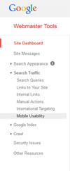
Mobile is more important every day. As outlined in an explanation from GWT,
“Because global web traffic from mobile devices is on the rise, and recent studies show that mobile visitors are more likely to revisit mobile-friendly sites, mobile usability is now relevant for optimal search results.” (https://support.google.com/webmasters/answer/6101188)
It should be inferred that if a local business’ site is doing poorly in local search, it is doing even worse in general search results. This is because, for that local business, there’s no such thing as general search just local. Everything local is now mobile, and often vice versa.
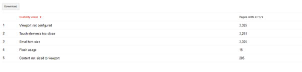
For many, the first encounter with GWT’s Mobile Usability feature will be scary. Chances are there are a number of issues that Google suggests impede a site’s usability via mobile devices. One of our clients with a fairly large website had over 3000 errors reported!
Fortunately, Google is reporting every instance of a mistake. If a site is driven by templates, the same mistake can be replicated hundreds or thousands of times. In many cases, fixing the problem only takes a few lines added to those templates or to the CSS files. In other instances however, some of the mistakes Google warns about will require a bit more effort and thought to fix.
Here is a quick rundown of the general mobile device problem areas Google issues warnings about. Five out of six problems involve how a website looks when it resolves on a mobile device.
Viewports: Viewports are defined viewing areas that adjust the site to the screen size of the device being used. Various devices have differing screen sizes. To complicate matters, older versions of those devices might use browsers with a resolution area slightly smaller than the reported screen size. Your website should look and act in a relatively similar way regardless of the device it is called on.
Using Fixed Width rather than a relative setting in the Viewport: Sometimes designers cheat a bit when it comes to building for a mobile environment. Site designed several years ago, or made to be non-responsive, often use a defined width for the browser to interpret, say 800px. The defined page width tells the web browser to make the page appear exactly that size. When a fixed width page is rendered on a screen smaller than the fixed width, relative chaos happens as the browser moves and bumps things together to make the page fit. The smartest way around this problem is to use responsive design in all websites so pages render the same on any sized screen.
Content not sized for Viewport: As with the page rendering issue noted above, when your content is sized to be larger than the screen it is displayed on and cannot be broken up, the browser will insert a horizontal scroll bar. Users hate horizontal scroll bars, especially on mobile devices. That means Google dislikes horizontal scroll bars as well as they degrade user experience. Google would rather reference pages that enhance user experience or help users find answers to their queries quickly and easily.
Flash Usage: Google does not like Flash. It never has and it probably never will. Over the years I’ve drawn a lot of heat from Flash developers because I keep saying Google does not like Flash. Luckily, Google has always agreed that it does not like Flash. It once tried really hard to like Flash and even developed a set of workarounds to parse text from Flash but things changed too quickly and it was complicated and Google dislikes complicated. If Google did like Flash, I’d write that Google likes Flash but it doesn’t. Therefore, if you want Google to list your website in search results, stop using it. It really is that simple and there’s no need to argue about it or to send me nasty emails or tweets. If you feel that strongly about the courses you took in Flash development six years ago, tell it to Google. Here’s what they will most likely say back, if they choose to respond at all.
“Most mobile browsers do not render Flash-based content. Therefore, mobile visitors will not be able to use a page that relies on Flash in order to display content, animations, or navigation. We recommend designing your look and feel and page animations using modern web technologies. Read more about Look and Feel in our Web Fundamentals guide.”
To recap… It’s not my fault Google dislikes Flash. Get over it because Google is going to pass over it and it really has nothing to do with me.
Font sized too small to read: This is a common problem when sites designed solely for desktop are rendered on a mobile device. You know how annoying it is to have to pinch and expand a screen area on a smart phone just to read the text? Once you do that, you create a horizontal slide that makes following the text from start to finish more difficult if you need to scroll down. Again, this is a user experience issue which Google believes will make users decide not to click over to pages they know will be more difficult to use.
Touch Elements too close: Smart phones and tablets tend to be operated by touch rather than by a mouse. You poke the link you wish to visit or tap your thumb on an image you want to expand. Given that various elements rendering on a mobile device activate by touch rather than deliberate mouse click, keeping those elements spaced far enough apart to allow users to touch something without risk of opening something else up is rather important to better user experience.
Pointing out a problem is one thing. Providing guidance around it is another. Google goes an extra step to provide webmasters with guidance on how to fix issues it notes. Google also provides detailed information links to its own webmaster guidelines. Drill down on any of the issues pointed out in your version of Google WebmasterTools Mobile Usability feature. It is likely to give you a week of work but the results will be well worth it.
Jim Hedger
Latest posts by Jim Hedger (see all)
- Get to Know the Google Webmaster Tools Mobile Usability Feature - November 13, 2014
- Lifting the Veil on Those Secret SEO Chats: State of the Industry - July 29, 2014
- State of the Industry – Real SEOs Solve Problems - July 15, 2014