The growing use of mobile devices for searching and researching information has changed not only how web marketers optimize for top search engine rankings, but it also forces us to rethink how to better engage with those mobile users. For years, as desktops dominated how people used the internet, the way content was presented hadn’t changed all that much (aside from producing more visual forms of content such as infographics, etc.).
But today’s online users are grabbing their mobile devices more than ever. If your content isn’t “mobile-ready,” you’re less likely to get it in front of your audience’s eyeballs than you were even just one year ago.
With Google’s recent update of its mobile algorithm, there have been a lot of articles written about how to make your website mobile ready. And in fact, heeding (most) of the advice you read will benefit you. But most of that information focuses on the presentation of the site overall, not necessarily the content itself.
Should Mobile Content Differ From Desktop Content?
The answer to that question is no. The content served to both your mobile visitors and desktop visitors should be nearly identical, with the exception of how it’s presented. But here is the issue: I think that we should write differently for mobile devices than how we have traditionally written for desktop. Since I’ve already stated that desktop content and mobile content should be the same, my case is that writing for mobile changes how we write for the web PERIOD.
One of the key differences in desktop vs. mobile content is the presentation of the content. Desktop screens tend to be much bigger and can display a lot more content at one time than can be done on a smartphone. A lot of people will think that the smaller screens mean we should present less content for them.
If you’ve written your content with your visitors in mind and focused on what information is needed to make a great user experience, changing your content just for mobile devices seems incredible foolhardy. On the other hand, if you’ve written your content with SEO in mind, without truly considering what your visitors need, it’s equally foolhardy to put that content on either your mobile site or the desktop site.
Content developed for your visitors is the content they need, regardless of the device. But if we have to tweak our content for the mobile audience, my suggestion is to take what we learn about mobile content usability and apply that to the desktop as well.
Make Desktop Content More Mobile-Like
On a desktop, scrolling with the mouse is pretty easy. Swiping on a phone isn’t that hard either, but pages with long content are much easier to handle on a desktop. It’s no problem to display thousands of words of content to read. But on a mobile device, scrolling isn’t quite as easy. This is why it has become a best practice to chunk content on mobile devices.
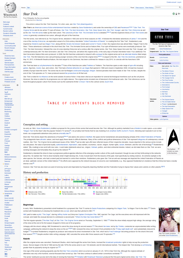
Take a look at the Star Trek Wikipedia page on a desktop computer:
This looks like a typical page with tons of content. What you see above isn’t even a quarter of the total content on the page. But when you view the same page on a mobile device, you see some pretty significant differences:
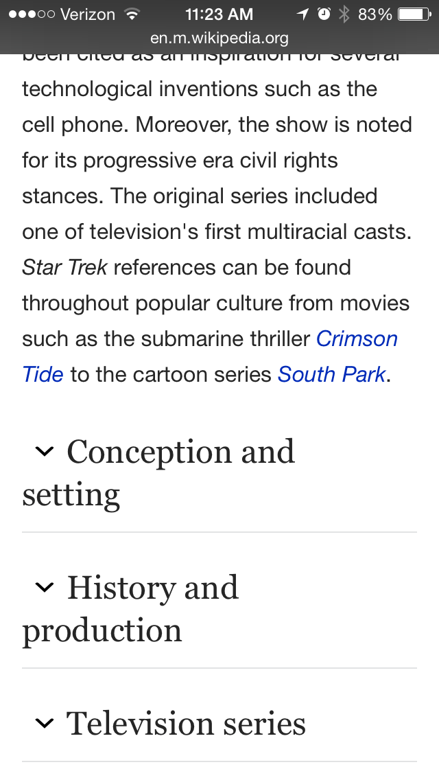
On the surface, it might appear as if the page has less content, but it doesn’t. It’s just the content is chunked into an accordion menu, making it available on command.
Presenting chunked content for mobile users is a great way to reduce the amount of scrolling necessary while giving readers the opportunity to see what content they are most interested in reading. And here is where we can take a lesson from mobile content and begin to apply it to the desktop. Those content chunks represent specific blocks of information. If you only want to know about Star Trek History and Production, you can jump right to that and pass up the rest. While the entire page can be read linearly, it can also be read in any order because each section is, essentially, a self-contained chapter.
Web writers have for years used headings and sub-headings to break up content. This improves readability and offers a similar solution to mobile chunking in allowing visitors to quickly jump to sections of the content they are most interested in.
But rarely is our content written so distinctly that turning sub-headings into chunked segments makes sense. We tend to write in a linear fashion. Miss the section above, the section below might not make sense.
Instead of using headings to break up the content, break up the content so each section becomes self contained like the Wikipedia page above. That’s what works great for mobile, so let’s apply that to desktop as well.
That doesn’t rule out the use of sub-headings for the sole purpose of breaking up content. You can do that as well. But long pieces of content should be broken into self-contained content chunks, each of those chunks using their own headings and sub-headings to make reading easier.
Reducing Content Value by Increasing Visitor Value
One of the arguments made against SEO is that they want too much content on the page in order to optimize it. Again, I say do what’s best for the visitors first. If you’re worried about the amount of visible content on any one page, put that aside for a minute and focus only on how much content is needed to give the visitors the information they need.
That might be a paragraph, that might be several paragraphs depending on the page. Don’t worry about the amount of content for each page. Instead focus only on the value of the content. Keep what’s valuable and ditch the rest.
In the end, if the content is “too much” for the page, we can take the idea of making some of that content available on demand in ways similar to how mobile devices use chunking.
This is usually an issue on product category pages. You want to make sure that your first row of products lands above the fold (on the viewable page before scrolling.) If the text pushes the content too far down, we need to chunk it.
On the desktop, you can do this in a number of ways. The simplest is to display one or two paragraphs of content with a call to action to “continue reading” or “read more.” When clicked, the rest of the content appears, pushing the rest of the page information down. This allows the reader to read the content if needed, or they can skip it by keeping it closed and get right to the products.
Another option would be to chunk the content into tabs. We see this a lot on product pages where one tab might have the product specifications, another might have reviews and another tab might have the features and benefits. This is a good way to make the visible page on the desktop more user friendly and keeping scrolling to a minimum. And it’s really no different than chunking on mobile, exept the chunks are horizontal rather than vertical.
One thing to keep in mind, though. The content in your hidden chunks will in fact be devalued by the search engines. Which means that the visible text will have far more weight than the non-visible text. However, I don’t think the non-visible text will be any more devalued than content that the visitor has to scroll to see. If scrolling is best for your visitors, do that. If chunking it into on-demand blocks makes more sense, don’t be afraid to do that either.
The web is constantly evolving, and the way we write and present content must evolve with it. While we present information differently between devices, I don’t think that means we have to present different information. But it does mean that the new technologies need to influence the old ways of doing things, even when using those old technologies.
We need to change the old way of thinking about and writing our content for the new generation of devices. By the nature of the device, mobile sites must be easier to use than desktop devices. But that doesn’t mean we can’t take the lessons applied to mobile in order to make our desktop site even better.
Stoney deGeyter
Latest posts by Stoney deGeyter (see all)
- Everyday Life Lessons That Guarantee Web Marketing Success - February 24, 2016
- Content is Meaningless – It’s The Messaging That Matters - January 13, 2016
- What Your Web Marketer Doesn’t Know (About You) Can Kill You - December 9, 2015
- The Pitfalls of a One-Man Web Marketing Band - November 3, 2015
- Mobile Content vs Desktop Content: What’s the Diff? - September 22, 2015