The logic behind Google’s decision is simple. The increase in smartphone searches created a need for websites to be user friendly on smaller screens. Websites that failed to be usable were not satisfactory to Google search users. While Google will continue to provide desktop versions from their mobile search index, they will rank responsive designed pages higher. Hence, the mad dash to redesign by the April 21, 2015 deadline.
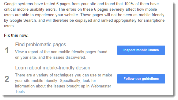
Websites tracked by Google Analytics and Google’s Webmaster Tools were provided with the results of Google’s mobile test. Website owners were sent an email warning them if their website failed. There is also a testing tool available.
Four test criteria are applied to each website tested for mobile friendly compliance by Google. They are:
- Avoids software that is not common on mobile devices, like Flash
- Uses text that is readable without zooming
- Sizes content to the screen so users don’t have to scroll horizontally or zoom
- Places links far enough apart so that the correct one can be easily tapped
If this sounds complicated, Google is very good at documentation and providing instructions, code and guidance in this Mobile SEO page.
Passing Google’s Mobile Test Is Just Phase One
Hasty decisions and the threat of the April 21 deadline may have contributed to poorly constructed layouts resulting in disastrous user experiences. Designing websites for smaller screens is complicated and requires a new skillset for user interface designers accustomed to desktop and tablet designs where there is more room to display content. Gone are the days where the advice was to produce two versions of one website. Responsive design is a more cost effective decision, but presents a new set of design, business, search engine, accessibility, functional and performance requirements specific to smaller screens. Add user personas and mental models to the mix, plus mobile and user testing with mobile devices and you can start to see the enormous scope of this undertaking.
Passing Google’s Mobile Test is Not 100% Accurate or Conclusive Mobile Testing
Passing Google’s mobile friendly does not mean your website will work on all mobile devices. It simply means it passes the criteria a Google bot is looking for. It is not mobile emulation testing. It is not mobile user testing. It is not mobile usability testing. In fact, the four Google checkpoints barely make a dent in successful mobile design.
With mobile website design, suddenly the controls and page elements we are used to seeing disappear. This forces us to re-learn a website we may already be familiar with or tackle a new one for the first time. Nothing beats the frustration of figuring out what’s located behind the “hamburger” navigation icon.
It is common to find that mobile website designs remove key areas of a page such as the call to action, log in or customer service phone number. Some render just the basics and remove appealing visuals or user instructions, as in the example of Travelocity. For some websites, the user experience changes depending on the device, such as tablet, smart phone, or operating system like Apple and Android. One website may render flawlessly on a desktop, but not on a Kindle in cases where there are three or four columns suddenly clamoring for attention with no guidance from the code.
Mobile sites do not always make users happy. The Zappos website passed the Google mobile test, but users are presented with a request to install the mobile application before gaining access to the website. This may be fine for people who are regular customers wanting to make a commitment, but to first timer visitors who have not had the opportunity to browse, it is an extra click in what may be an environment with distractions.
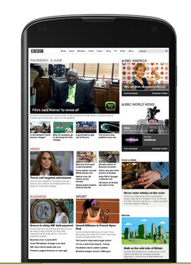
The BBC website failed Google’s mobile test, as seen here. However, it did not display this version on my live and emulation device mobile tests. This is a critical reminder that designs must be tested on actual mobile devices.
The Travelocity website severely limits their mobile version to just the use of the booking application. While it passes Google’s mobile device requirements, they removed their attractive visuals that appear on the desktop version, as well as some of the other tasks that can be performed. A first-time visitor to Travelocity may never see the more attractive desktop version. In this example, mental models are important. The data collected by the company is used to help determine what elements are the most vital for the mobile user experience. Sadly, ease of use sometimes means removing strikingly beautiful images that don’t contribute to the task.
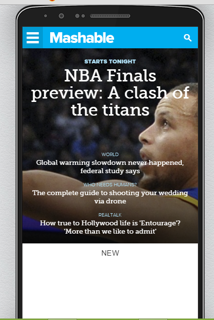
Mashable passes Google’s mobile test. Their mobile device layout presents their main header image and the entire navigation menu is reduced to a “hamburger” icon. The CNN website uses this same solution for their responsive design.
Additional Mobile Testing is Needed
While mobile devices have been around for years, mobile design itself has been slow to catch on as a website and business requirement. Mobile device emulation testing has been conducted by usability professionals as part of user testing and website usability audits, but only as an add-on or if the company was savvy enough to project an increase in users wanting to use their websites from smartphones. Google’s call to mobile-arms caught many by surprise and when online marketers realized that rank was part of the story, they fired up a frenzy of new services to include responsive design and chased down any available Bootstrap developer they could locate.
The result is that most WordPress responsive templates look exactly the same. They are not all tested for usability, user experience and performance. To wit, more and more mobile applications are uninstalled because they drain devices or are difficult to use. Findability and usability on mobile websites is hampered not only by the design itself, but the environment in which mobile devices are most commonly used.
A Google bot is not sitting on a train commuting to work reading news headlines or ordering products from a form on Amazon. A Google bot is not concerned with conducting most of the tasks we do on websites. People perform tasks, such as online forums members who want the log-in area to appear at the top of the page and fast loading pages so they can see new discussions or post comments. Or, for instance, an educational website that has different sections for students and teachers to log in or register should display these calls to action prompts in full view rather than hidden away. Bots are not forced to click away ads and forms draped over content.
Mobile design is more than stacking rows of product images or hiding videos. There is the “fat finger” rule for clicking on buttons and text (ask anyone with big hands and fingers about their mobile device usage experiences). Consider typing in passwords and filling out fields in environments where there are distractions or poor lighting, reading blog posts when the cell phone signal disappears, the user who is a one finger typist or new to using a smartphone, and the emotional state of the user. Ask anyone who is crying or shaking after a fender bender and trying to search from their Apple phone for the nearest tow truck about their experiences with slow loading, local websites.
The point is this. For your mobile website to work as you hope, think about the tasks you want your mobile visitors to perform and not just what Google requires for its search engine. If your customers are expected to find, review, rate or buy online, does your mobile design make this easy to do without errors? Many mobile users are simply not that experienced or familiar with their mobile device. This is a performance issue you may not have control over, but you can certainly invite participates for user testing and watch them using your website with various devices.
Finally, responsive design must be attentive to the fears and concerns that mobile users have regarding privacy and security. In your efforts to remove content to save space, don’t remove assurances about confidentiality. In general, responsive design has the same user experience requirements as desktop layouts regarding ease of use, understandability, persuasive design, navigation and desirability. The small screen forces us to re-think usability for a future where the devices we use are attached to our bodies by phone, watch, microchip or contact lenses.
Google’s search engine mobile test is just the tip of what’s to come.
Kim Krause Berg
Latest posts by Kim Krause Berg (see all)
- Test Driving Google’s Accessibility Apps & Tools for Android - April 14, 2016
- Raven Tools Happy With Balance of Remote Office and In-House Work Environment - February 17, 2016
- Why Accessibility Will Matter More in 2016 and Beyond - January 12, 2016
- SEO is Not Part of Website Development? Really? - November 19, 2015
- Mobile Testing Beyond Google’s Responsive Web Design Test Requirements - June 8, 2015