 Bing has made many changes over the years to make their search results closer to Google’s style of search results. Bing is testing a significant new design that makes their search header – what appears as the search box and tabs below it – much closer to Google’s version. In fact, it would easily be mistaken as Google’s.
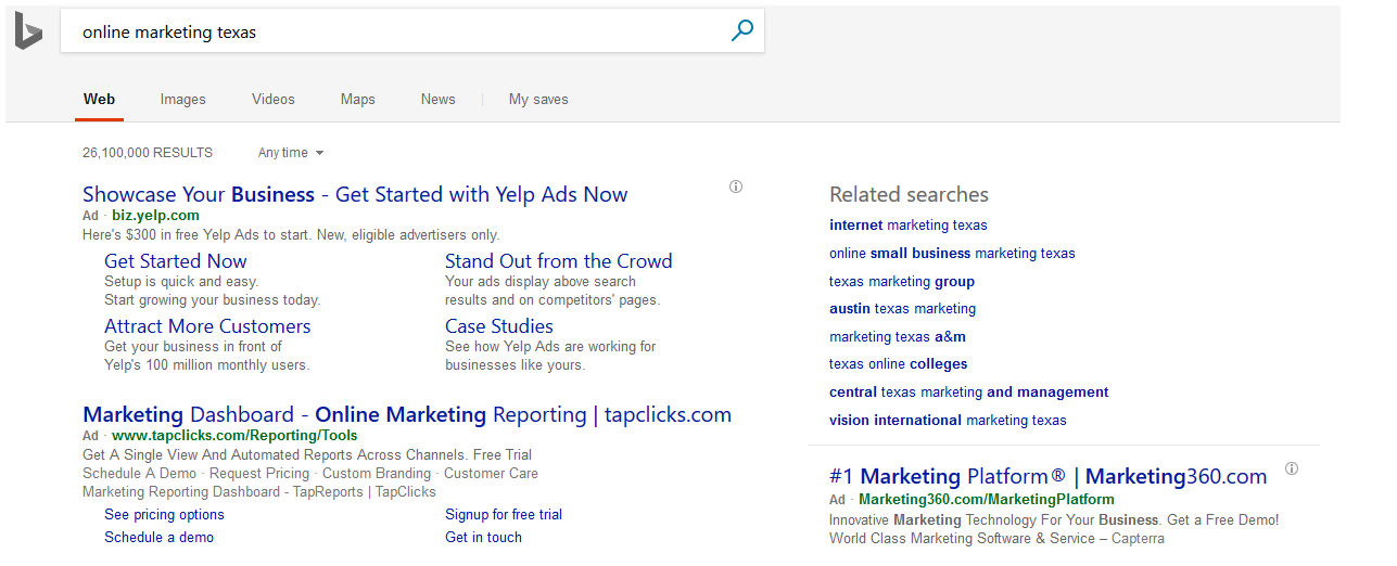
Here is what it looks like:
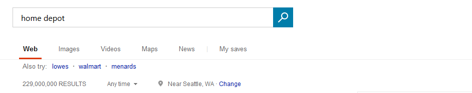
Here is what it usually looks like:
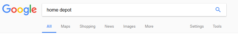
And by comparison, here is Google’s version of the header – you can see it is nearly identical in style to Bing’s test, right down to the colored magnifying glass, the gray background (although Google’s is slightly lighter in shade) and the underlined tab:
The gray background does provide a bit better definition between the header and the search results.
This does appear to be a limited test by Bing at this time. I was unable to replicate the test.
Thank you to Frank Sandtmann for noticing this and sending the screenshot to The SEM Post.
Jennifer Slegg
Latest posts by Jennifer Slegg (see all)
- 2022 Update for Google Quality Rater Guidelines – Big YMYL Updates - August 1, 2022
- Google Quality Rater Guidelines: The Low Quality 2021 Update - October 19, 2021
- Rethinking Affiliate Sites With Google’s Product Review Update - April 23, 2021
- New Google Quality Rater Guidelines, Update Adds Emphasis on Needs Met - October 16, 2020
- Google Updates Experiment Statistics for Quality Raters - October 6, 2020