 Google has made the switch to a brand new UI style for all users. The new style, which has been tested over the past few months, has been made permanent.
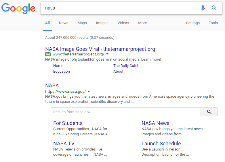
It is easiest to tell if you have the new UI or not by looking right under the search box. If you see the “Settings” and “Tools” under the right side of the box, you have the new UI.
Here is what the new UI looks like:
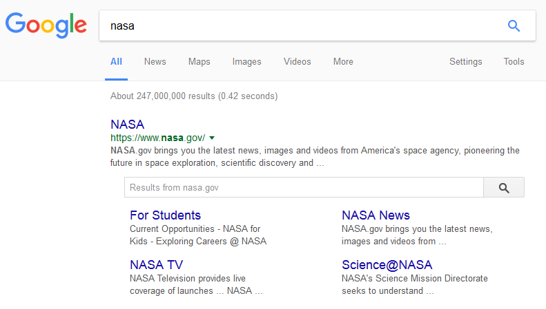
Here are the changes:
- The Google logo is significantly larger
- The navigation line underneath the search bar matches the color surrounding the box and logo
- Settings has moved to the right side of the bar
- Tools has been added
- The search icon is a blue magnifying glass
- The search box is now shadowed
- The More link no longer has the drop down arrow
- More cards
If you use Chrome to search, Google has also launched an additional feature – they have changed the font completely to a new one – Roboto.
The results also include many more cards in the search results on desktop, bringing it closer to the mobile style of search results. Google recently began testing cards for the news results, not to mention various carousels that have been added recently.
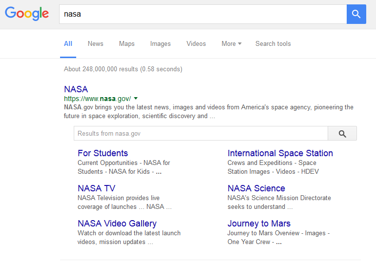
Here is what the old UI looks like:
This UI is rolling out worldwide and it seems most users have it since it began rolling out over the weekend.
Jennifer Slegg
Latest posts by Jennifer Slegg (see all)
- 2022 Update for Google Quality Rater Guidelines – Big YMYL Updates - August 1, 2022
- Google Quality Rater Guidelines: The Low Quality 2021 Update - October 19, 2021
- Rethinking Affiliate Sites With Google’s Product Review Update - April 23, 2021
- New Google Quality Rater Guidelines, Update Adds Emphasis on Needs Met - October 16, 2020
- Google Updates Experiment Statistics for Quality Raters - October 6, 2020